Universally Designed Remote Learning

There is so much to this topic that not one blog post or one webinar can cover it all. At it's core Universal Design for Learning (UDL) strives to eliminate barriers to learning. In order to eliminate barriers and be proactive, we first need to identify them. Identifying barriers to remote learning during this time of crisis hasn't really been a problem though, has it? I see memes and frustration expressed all over social media. Every school district has different resources and supports at it's disposal and I truly believe that everyone is doing the very best they can in education during these unchartered waters. We, as parents and educators, have to allow ourselves grace. None of this is easy, and none of it was planned for. We threw ourselves in and are doing the best we can. Now with that being said, there are some some practical solutions that are easy to implement to help make our remote learning accessible for all.
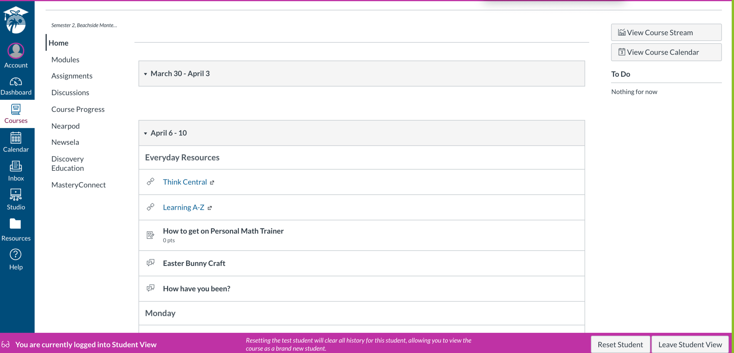
Let's begin first and foremost with access. Access can refer to many things. For teachers, I'm going to start with how easy your course (in Canvas) is to navigate for your students. If your students (and their parents for that matter) cannot figure out where to get started, how to proceed logically and how to find what they need, then really, how accessible is it? This is the base level of accessibility. Part of what I love about the LMS Canvas is that it's set up in modules. These are intuitive for students for all ages. A misconception is that the landing page or home page of the course needs to be fancy and beautiful. It actually doesn't. But also, sometimes the fancy gets in the way of the students actually finding what they need. Here's my recommendations for simplifying your life in Canvas and making it more accessible for your students.
Navigation Bar on the Left
There are so many options and too many things to click on. It can be overwhelming. All you really need is
Home
Announcements
Modules
Grades
Syllabus (optional)
All the rest you hide by going to settings and clicking on Navigation. You really don't need Discussions or Quizzes or any of that in your navigation bar. You want students to access those things in the correct order within your module, not on their own anyway.
Modules
The simplest way is to make each module a week. For example, a module could be "April 6-10."
Then insert a text header for each day of the week (this takes seconds and is key for organization).
Monday
Tuesday
Wednesday
Thursday
Friday
Then under each text header with a single indent, put in each assignment, activity, etc. that you want your students to do that day, in order. This makes it so that your students can click on the first assignment under "Monday, April 6, 2020" and go from there. After they finish that video, reading, activity, discussion, assignment, etc. all they have to do is click "Next" at the bottom of the page. By putting things in modules this way, we allow students to just click "next" to get to each assignment for the day without every having to navigate away. This is intuitive and easy. My son's amazing 3rd grade teacher did this, without bells and whistles and it worked wonderfully. After only 2 days of sitting with him last week, he was then able to finish out the week unassisted because it was so user friendly and intuitive.

Duplication
Once you have the module set up with the days of the week you can simply copy the whole module for the next week. (This is why you don't put dates in the text headers, just days of the week). No need to do extra work or recreate the wheel.
Add Ons
You can always add more on later, but this is a quick, easy way to start that is easy to follow for students and parents. You may choose to add on a text header in your module that says "Everyday Resources" under which you include anything that you'd like the students to complete and use daily.